Rethinking the Tiny Sign That Runs Your Big Meeting
You walk into a boardroom and the seats are half wrong. Placards don’t match faces. People smile, then shuffle. A digital name plate could fix that, yet many teams still fight the same mix-ups. A recent ops review I saw clocked delays at about 10–15% of meetings, just from label confusion and last‑minute swaps. That adds up over a quarter. Not to mention the subtle stuff—like mispronounced names or wrong titles—that can derail the mood.
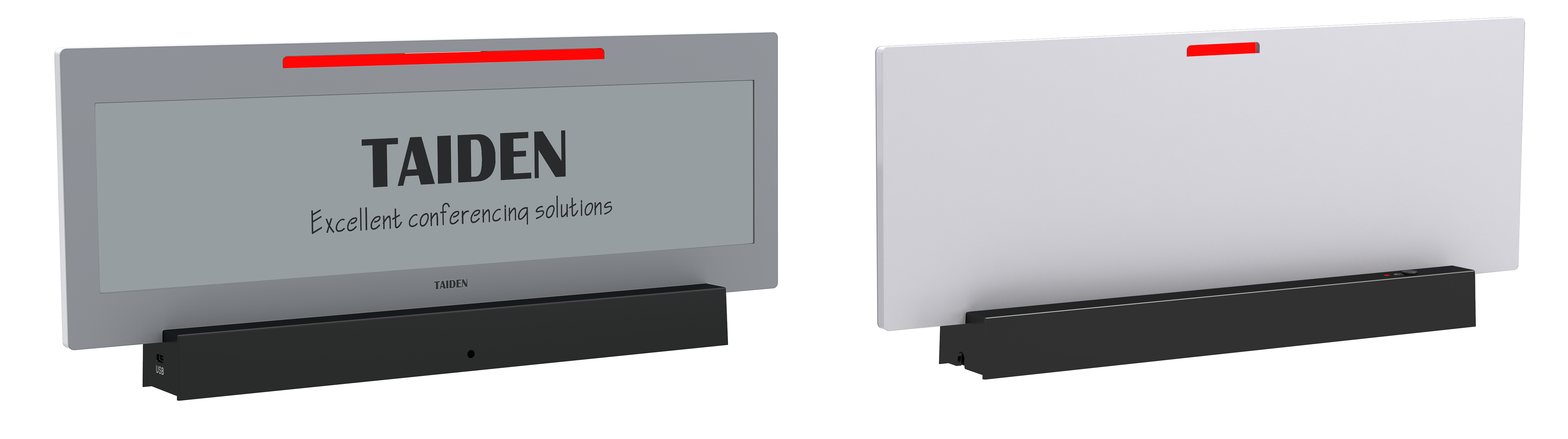
Now zoom out. You have execs from two regions flying in. One person switches seats for the screen sightline. Another gets added five minutes before kickoff. The table looks set, but the data does not. The person running the room does a quick patch with paper. Everyone nods and moves on. But the flow is off. Why keep chasing fixes that fail under small stress?
Here’s the big question: what would it take for the label system to adapt as fast as people move? With no drama, no guesswork, and no cable spaghetti? (And yeah, we’d like it to look good too.) Let’s start at the root, then stack the options that actually work—funny how that works, right?
Hidden Friction: What Breaks in the Old Setup
Where do “simple” table tags go wrong?
When teams test conference table name plates, they often compare them to paper tents and engraved blocks. On paper, those old tools seem cheap and fast. In live rooms, they are slow. Titles change. Seats move. Paper curls. Markers smear. And two minutes before the keynote, someone asks for a last‑second role swap— that’s the catch. The deeper issue is flow, not ink. People need labels that sync with the agenda and the roster, in real time, without a mini‑IT project on the table.
The technical gap is also real. Legacy table signs rely on manual updates. No data link. No device health check. When screens enter the mix, many setups bolt on power strips and wall warts, then hope for the best. That creates heat, cable mess, and noise. It also creates failure points in power converters and loose plugs. A smarter design treats each unit like a tiny endpoint, with clean power over Ethernet (PoE), safe firmware, and low‑power wireless for status. Think of them as edge computing nodes, not props. Look, it’s simpler than you think: labels should pull data from the same source as the agenda, then show the right name, role, and seat—every time.

Comparative Insight: Principles That Make the Upgrade Worth It
What’s Next
Let’s stand the options side by side and look at how they work. E‑paper screens use reflected light, so they stay readable without glare and draw power only when they refresh. That is ideal for shifting seating charts and clean tables. A modern stack pairs PoE for stable power with device management for remote checks, logs, and quick resets. Add OTA updates so you can push a layout change to the entire room in seconds—no handholding. When you fold in an e ink meeting room display, the same principles apply across doors, walls, and tables. One content pipeline. One source of truth. Different form factors, same rules. Less drift. Fewer surprises.
Compared to ad‑hoc paper or DIY tablets, the new baseline wins on three fronts: power discipline, content sync, and lifecycle care. Fewer cords. No hot screens. Updates that follow the agenda instead of the other way around. You also get richer options like name pronunciation notes, dual‑language titles, or a small QR for quick profile pulls (kept behind the network gate). And if your rooms need centralized control, a lightweight MQTT gateway and health dashboard keep signals tidy. The point is simple—better gear reduces human patchwork and saves minutes you actually feel. To choose well, use three checks: 1) Update speed at scale, including last‑minute seat changes; 2) Power and uptime model, ideally PoE plus low‑power wireless status; 3) Fleet management depth, from role‑based access to clean OTA and logs. Measure those, then decide. The brand that fits your ops best may surprise you — funny how that works, right? Learn more at TAIDEN.